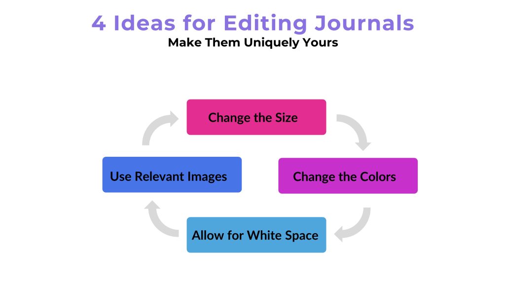
One question we get asked quite frequently is how (and what) changes can be made when editing done-for-you journals (or other PLR products for that matter). Here are 4 simple changes that are quick to implement that will make your PLR journals unique to you and your readers.
Change the colors. The colors you use are important. They are what give your audience a certain feeling. Learning about the psychology of color will help you choose the right colors that will help you lead your audience in the direction you want them to go for their journal. Think about what you want your audience to feel.
For example, blue is often seen as professional. But the tone of the color blue can also change how a person feels. A pale blue feels soft and innocent. While a stark navy blue can evoke power and authority.
Change the size. Another thing is the size of the journal. Make sure you know the size you’re making your journal is correct for your audience and for the POD platform. That way every line shows up looking correct and prints out perfectly. Read the instructions on your choice of POD before even getting started to avoid issues, especially if someone is making your graphics. Your customers won’t be delighted with your product if it prints out misaligned.
Use Relavent Images. One thing that can really enhance (or detract from) your journal are the images. Don’t skimp when it comes to the images you choose to put into your print journal. First, ensure that you have the legal right to use the image commercially, then make sure you use the sizes and resolution (usually 300ppi) required for printing. These specifics will be listed on the POD company you chose. Choose images that are relevant to the topic or theme you are trying to convey.
For instance, if you’re using the “My Best Life” journal, and your audience is empty nest women, you wouldn’t use images of teenagers doodling on their iPad. Instead, you should choose images of different types of art, writing, or other types of interests featuring mature women or without people in them.
Leave Plenty of White Space. White space is a good thing. Don’t get overly concerned about empty pages. After all, it’s a journal that is meant to be written in. It needs space to write the information down. Also, don’t feel as if every single page must have a quote or artwork on it. The important thing is that the cover, design, and purpose of your journal are clear so that your buyer knows how to use it.
If You Need Some Journals …

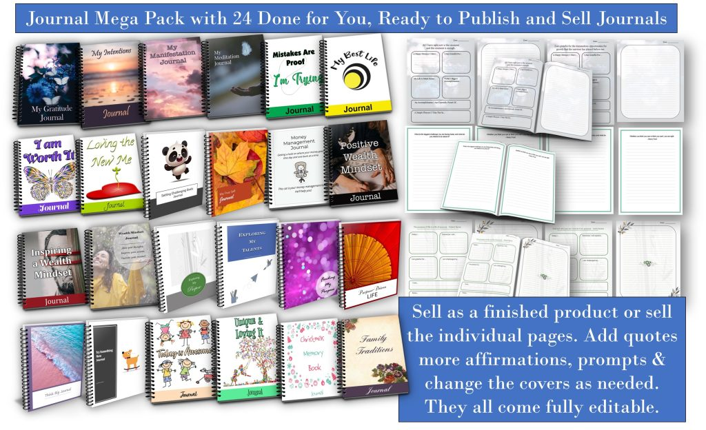
Here are 24 journals and templates that you can get to put these 4 editing ideas into motion to make the journals unique to you.
To your publishing success,

Yusef Kulan and Alice Seba
Your Partners in Easy Product Creation at EKitHub.com
